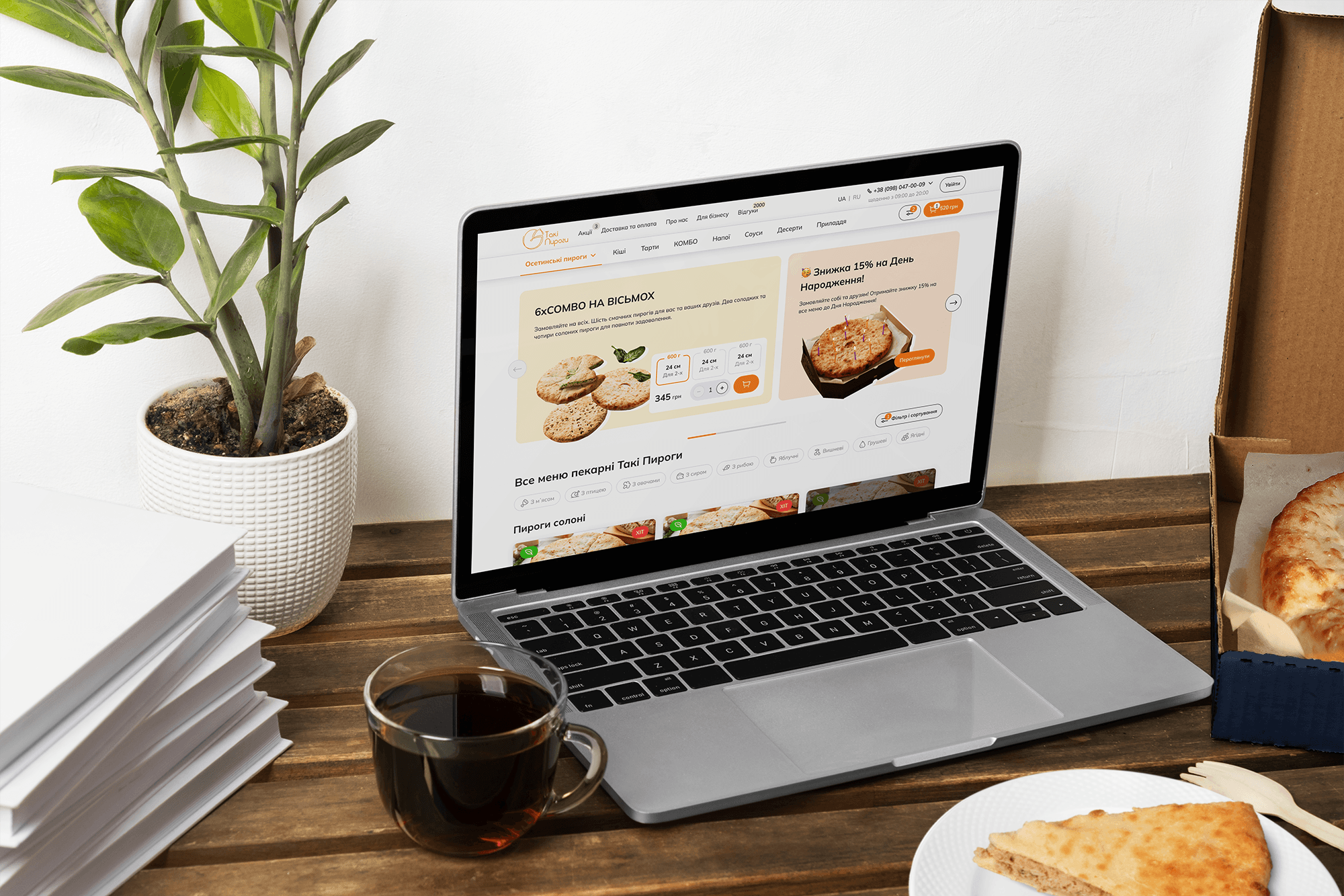
Taki Pyrohy - Pie delivery website redesign
Date
2023
Service
E-commerce, Design System
Client
Taki Pyrohy
Project Overview
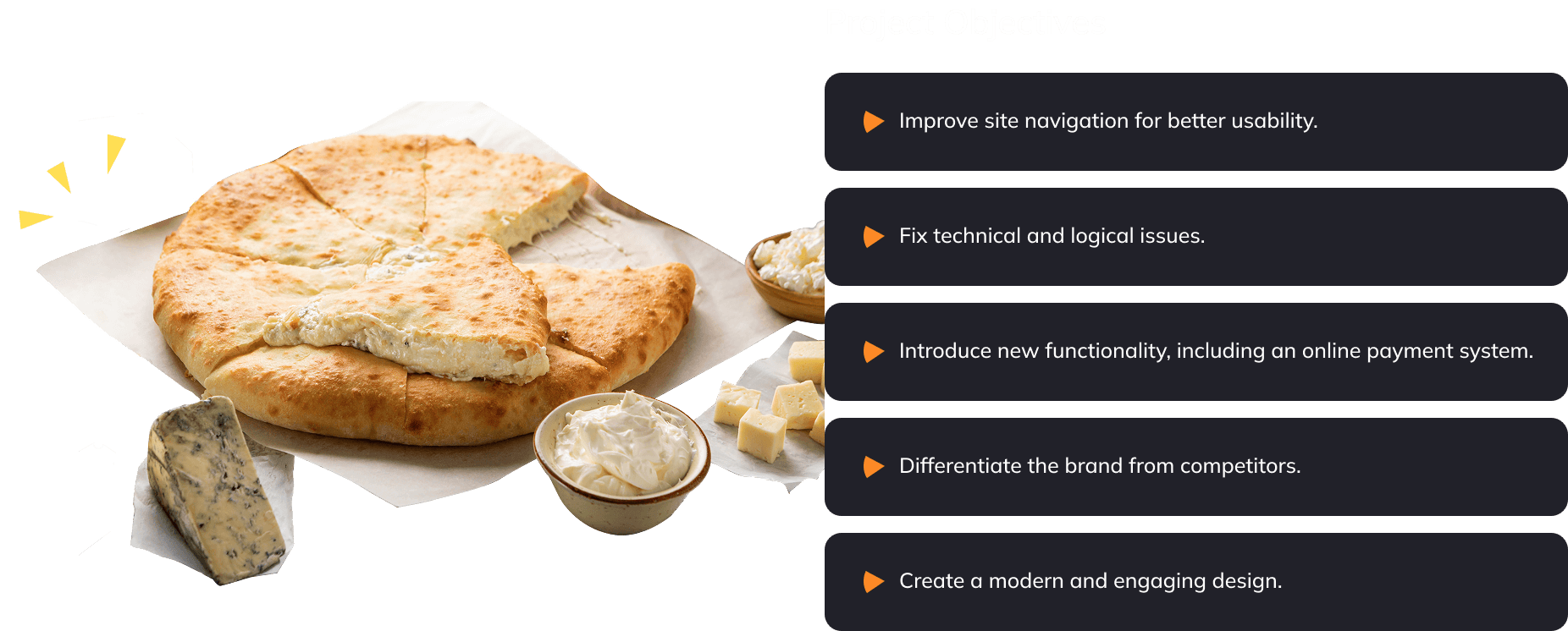
Taki Pyrohy, a leading bakery specializing in pie delivery in Kyiv, is well known for its exceptional quality, meticulous approach, and superior customer service. However, their website was not effectively communicating these values. The outdated design, complex navigation, and similarity to competitor websites led to high bounce rates and low engagement. Additionally, the site lacked a payment option, which limited its functionality.


Approach
To address these challenges, I followed the Design Thinking process, ensuring that each decision was user-centric and data-driven.
Research and Discovery
User Research and Insights
I conducted an in-depth kick-off meeting with the client to align on business goals. Key takeaways included:
The website should build trust and reflect the high quality of their products.
First impressions are crucial—users should immediately recognize Taki Pyrohy’s superior standards.
Competitive advantages include high-quality ingredients, affordable prices, excellent customer service, and free delivery for orders over 500 UAH.
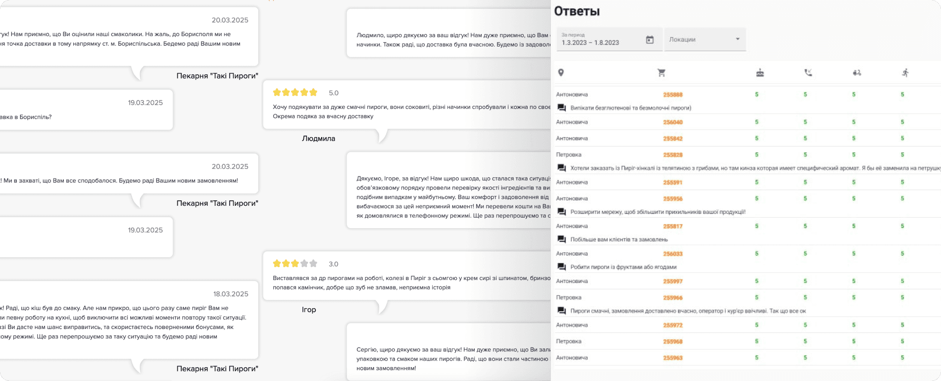
Analysis of feedback and questionnaire
To further understand user pain points, we analyzed feedback collected through post-purchase surveys. The results confirmed that customers were frustrated by the website’s limited functionality and often confused Taki Pyrohy with competitors who had similar branding.
Competitive Analysis
In order to get a solid understanding of how competitors are doing in the market and to lay out a solid foundation, I did a competitor analysis which consisted of direct, indirect and product competitors.
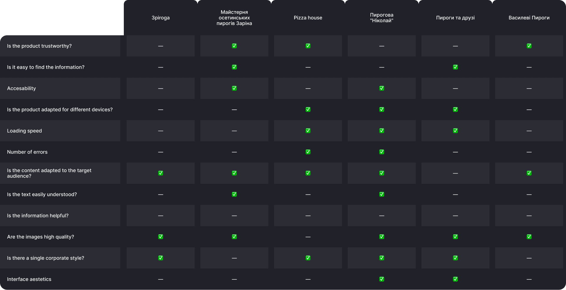
Common Issues Among Competitors:
Complicated checkout process
Hard-to-read fonts
No delivery area map
Limited information about delivery and payment
No reviews or company history, or heavily moderated reviews
Outdated design
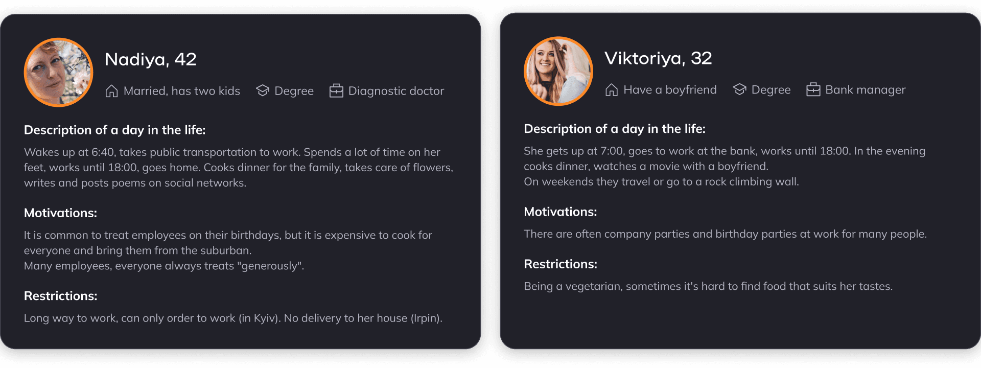
Personas
Based on research, I created personas representing Taki Pyrohy’s target audience—primarily women aged 25–45. These personas helped guide design decisions, ensuring a user-centric experience.

Key Takeways
🔀 Users struggle with navigation and functionality – The website does not clearly communicate the brand’s value and has an outdated interface similar to competitors.
💬 Customer feedback confirms dissatisfaction – Surveys revealed frustration with limited functionality and confusion due to branding similarities with competitors.
📉 Competitors use similar design approaches, but differentiation opportunities exist – Competitive analysis showed areas where Taki Pyrohy could stand out.
👩💻 The target audience expects a modern, user-friendly, and professional website – Women aged 25–45 need a platform that reinforces product quality and trustworthiness.
UX/UI Improvements
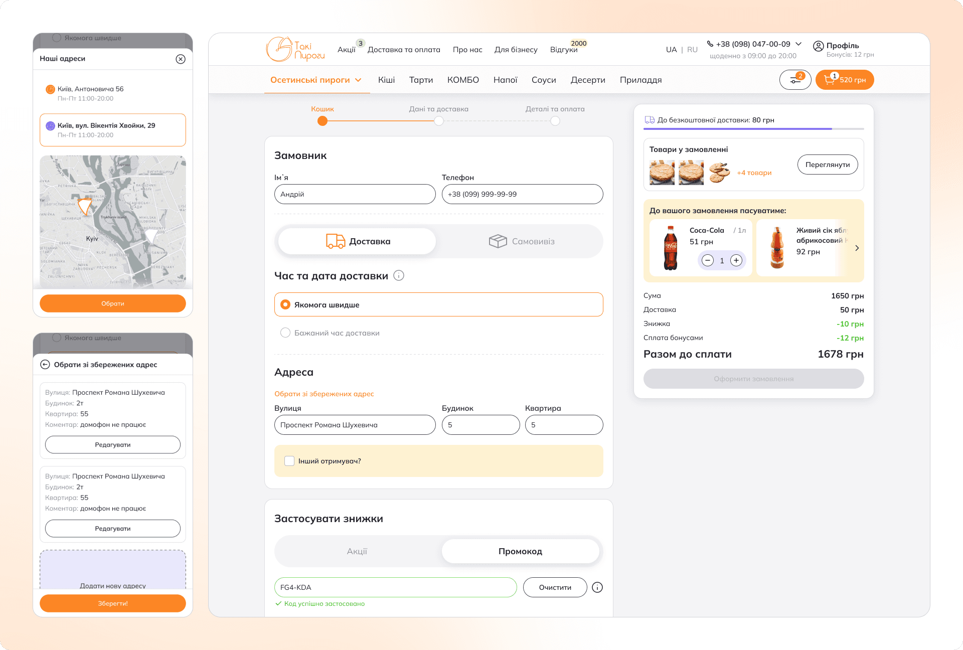
User Flow Redesign: Simplified checkout process with intuitive steps.
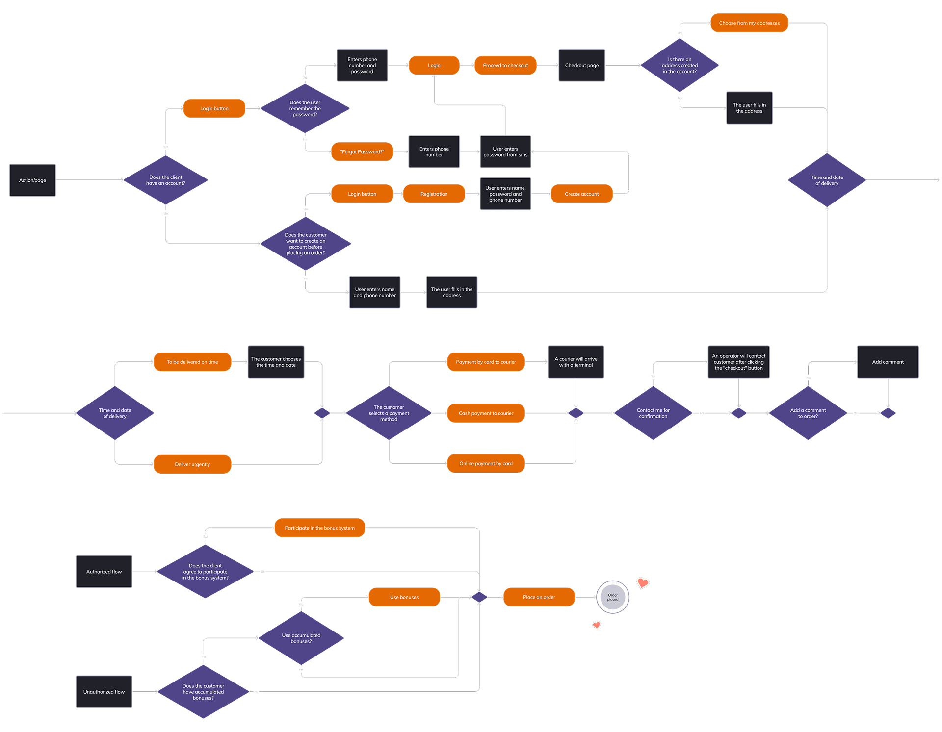
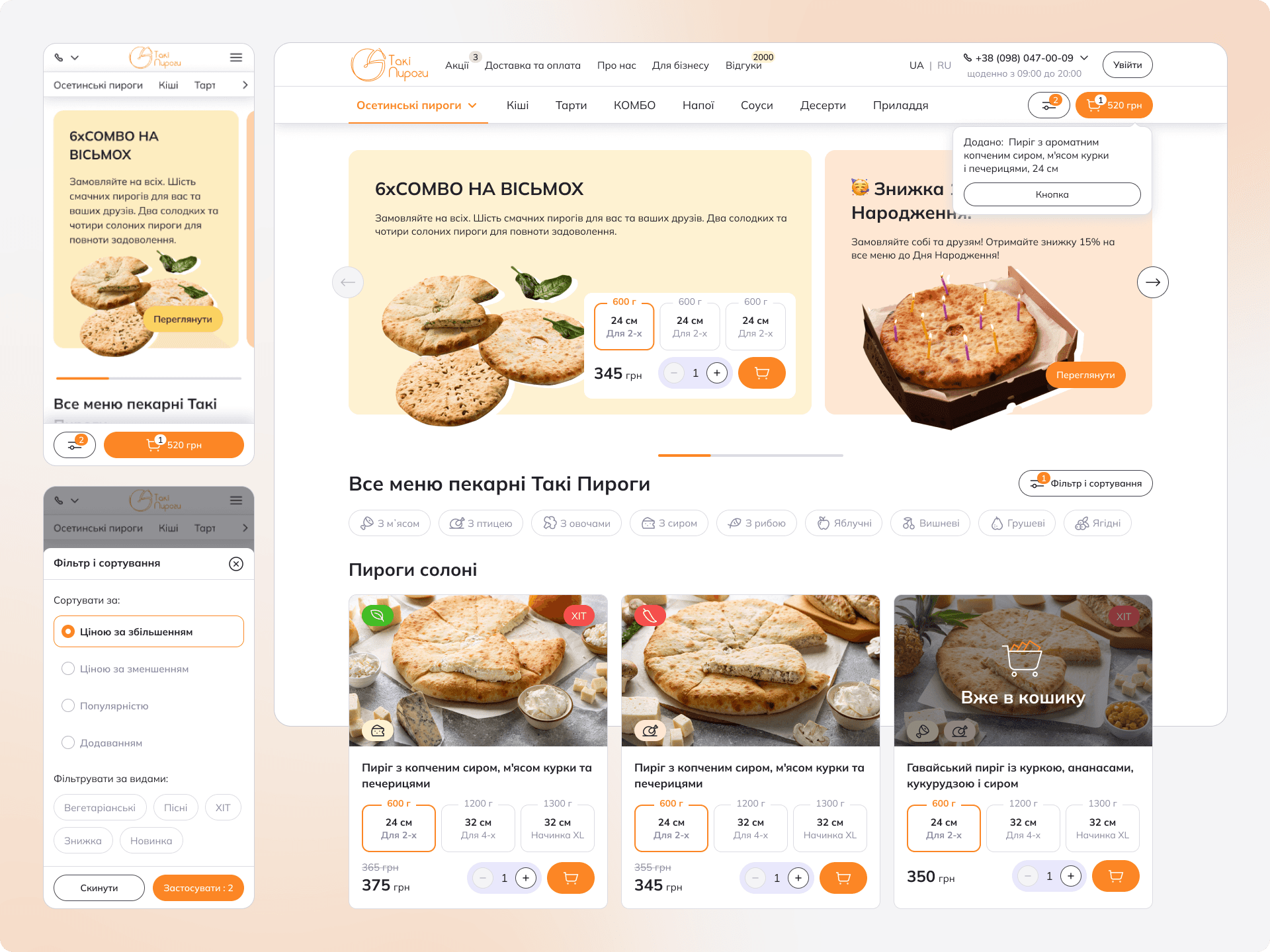
Sitemap Optimization: Two-tier navigation with a dedicated submenu for products, since human short-term memory usually operates in the range of 5 to 9 items.

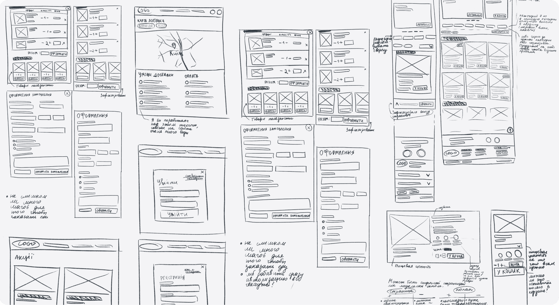
Low- and High-Fidelity Wireframes: Multiple iterations to refine usability and aesthetics.
Interactive Prototype: A fully functional high-fidelity prototype to test and validate improvements.

Validation: Usability Testing
I conducted usability tests with five respondents (four remote, one in-person).
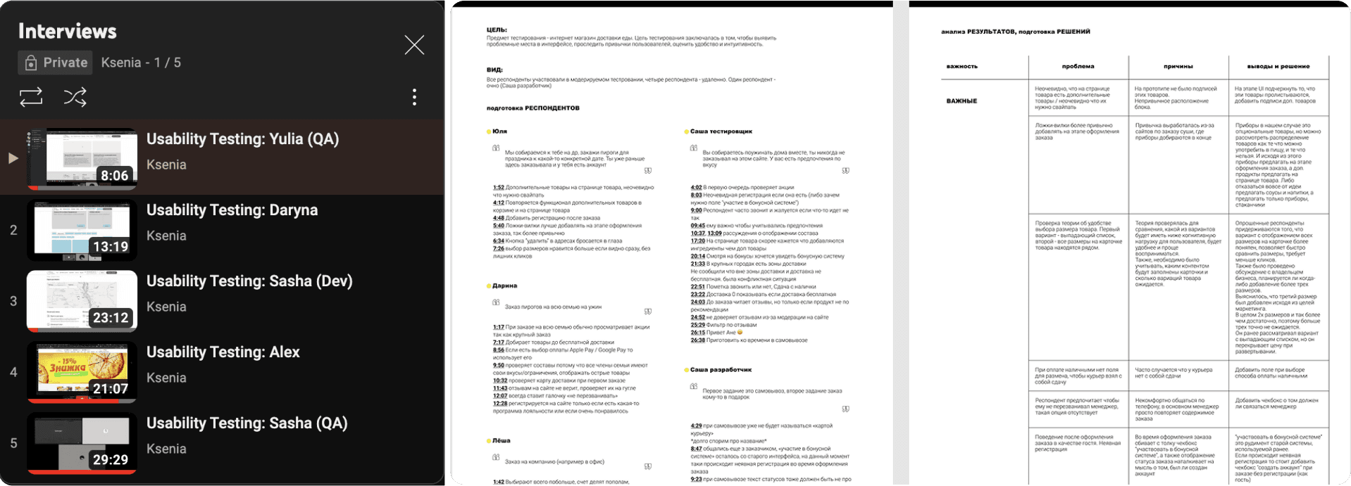
Key findings and solutions:
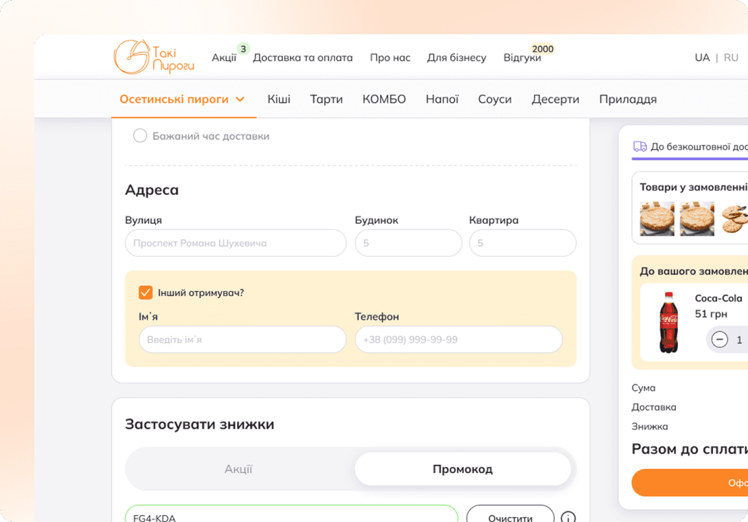 | 📦 Issue: Users couldn’t specify a different recipient (e.g., for gifting or business orders). ✅ Solution: Added an option to choose a different receiver during checkout. |
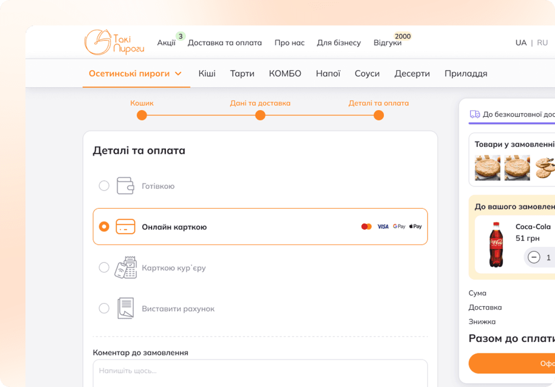 | 💬 Issue: Users struggled to find the comment field. ✅ Solution: Renamed the step from “Order Payment” to “Details and Payment” for clarity. |
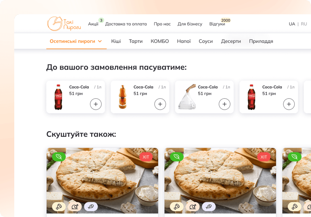 | 🧃Issue: Additional products on the product page were not obvious. ✅ Solution: Created a separate block with additional products, incorporating visible arrows and buttons for easy product selection. |
 | 💳 Issue: Users preferred Apple Pay/Google Pay over manual card entry. ✅ Solution: Integrated Apple Pay and Google Pay as payment options. |
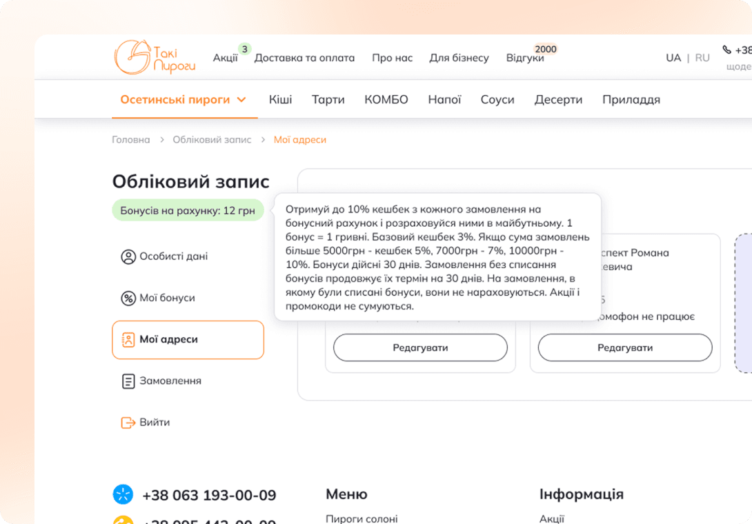 | 🎁 Issue: Users wanted a clearer explanation of the bonus system within the user account. ✅ Solution: Made the bonus label clickable and added a tooltip with system details. |
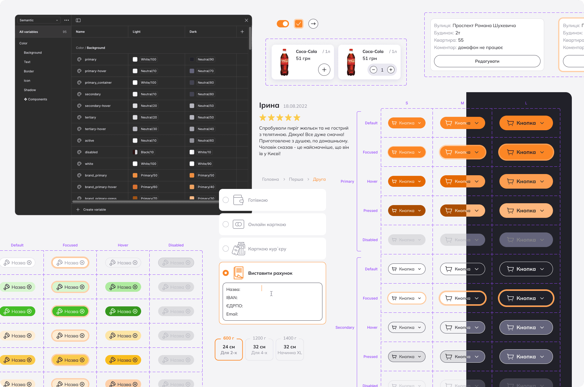
🔄 Iteration: Design System & Marketing Page Redesigns
I continued refining the design and working on additional improvements, collaborating closely with the client and their marketing specialist to enhance key aspects of the website. In a new design iteration, I introduced:
🎨 Design System
To ensure consistency and scalability, I built a comprehensive design system that included typography, color palette, UI components, and reusable elements.
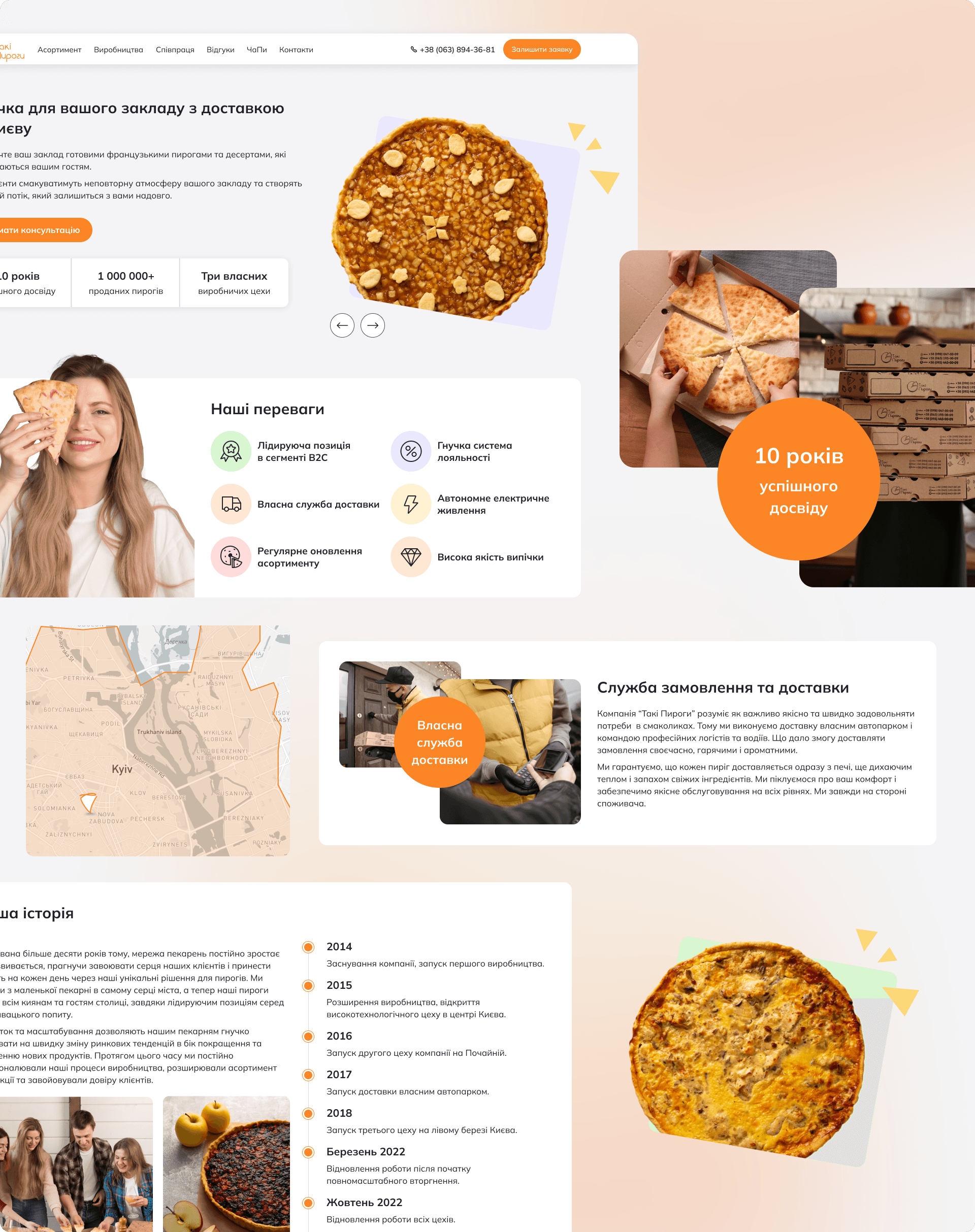
📢 Marketing Pages Redesigns
In collaboration with a marketing specialist, I reworked several key marketing pages to improve messaging, clarity, and conversion rates.

Conclusions
By prioritizing usability, optimizing the navigation, and integrating modern design elements, I transformed Taki Pyrohy’s website into a more intuitive and engaging experience. The redesign not only improved customer satisfaction but also strengthened brand differentiation, ultimately contributing to increased sales and trust in the company.
This case study highlights how a thoughtful, user-centered design approach can address business challenges and elevate a brand’s digital presence.
More Project